Your pantry could be one label away from looking like it belongs in a home organization magazine. You know the kind — matching fonts, clean lines, little jars lined up like tiny soldiers. The good news? You don’t need a design degree, a Cricut, or a Pinterest-famous budget to get there. All you need are a few simple tools, a little strategy, and this guide.
Start With the Right Materials
Before you design a single label, getting your supplies right makes all the difference. Cheap labels peel, smudge, and curl — and nothing kills the professional look faster than a label drooping off a flour canister.
Here’s what works best:
- Waterproof label paper — essential for anything near the sink or fridge
- A laser printer (inkjet can smear when wet) or a label maker like a DYMO or Brother P-touch
- Clear or white matte labels — matte finishes photograph beautifully and look more upscale than glossy
- A craft knife and cutting mat if you’re trimming custom shapes
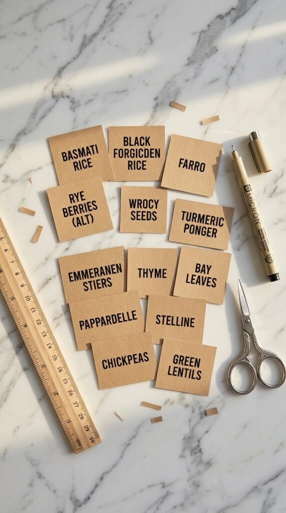
If you’re going the handwritten route, a fine-tip paint pen or a Micron marker on kraft paper labels gives that artisan, farmhouse feel without looking sloppy.
Choose a Font (and Stick to It)
This is where most DIY labels fall apart — too many fonts, too many sizes, zero cohesion. Professionals use one or two fonts max.
A winning combo:
- One clean sans-serif for the main label name (think: Montserrat, Lato, or Futura)
- One script or handwritten font for subcategories or decorative details
Free tools like Canva make this incredibly easy. Search “pantry label template,” customize the text, and print at home. Canva even lets you resize everything to fit your exact containers — no guesswork needed.
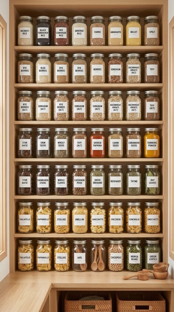
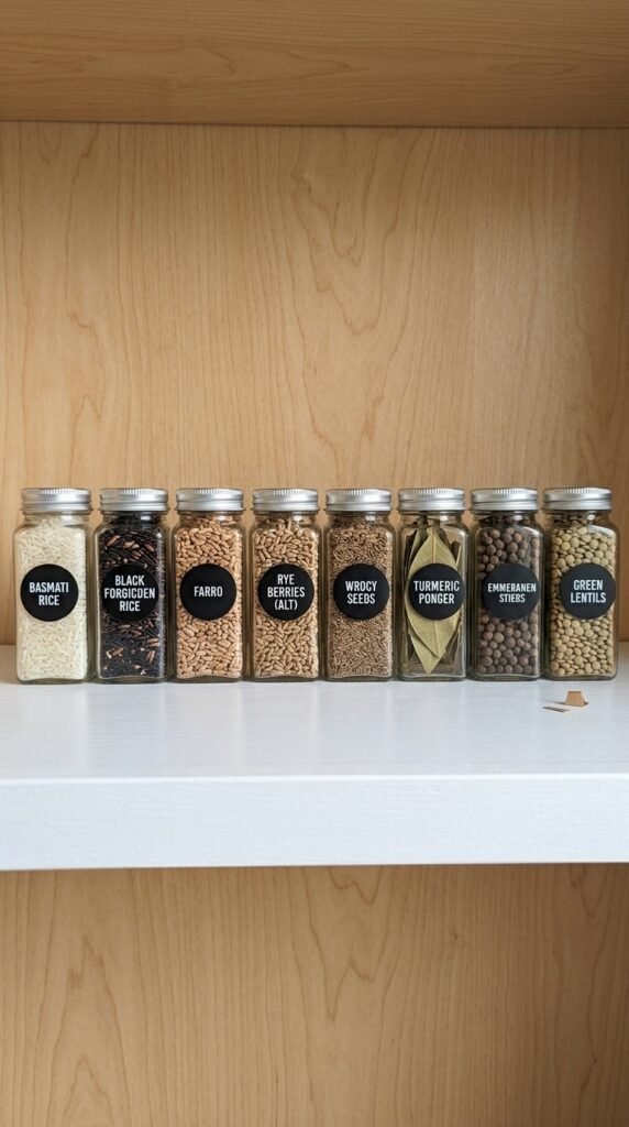
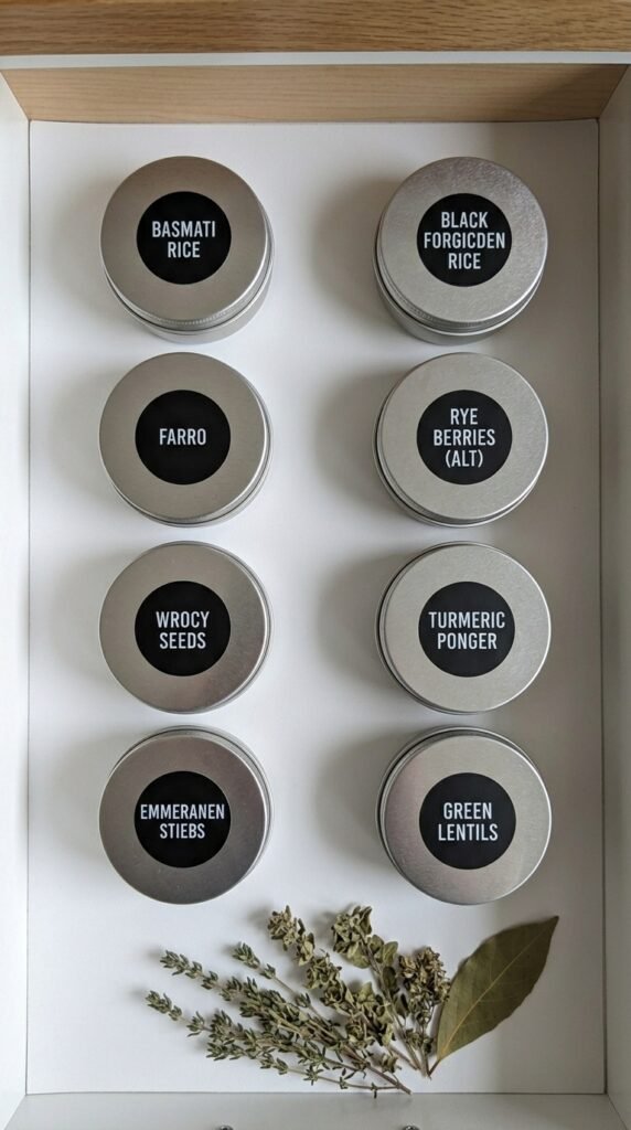
Match Your Labels to Your Containers
Here’s a pro secret: the label style should follow the container style. A rustic mason jar calls for a round kraft label. A sleek acrylic canister begs for a clean white rectangle with minimal text.
Ask yourself:
- Shape of container → round, square, tall, or short?
- Color palette → are your containers clear, white, black, or wood-toned?
- Vibe → farmhouse cozy, modern minimal, or colorful and playful?
Once you’ve defined your aesthetic, every label decision becomes easier. Consistency is what makes an organized pantry look designed rather than just tidy.
Print, Cut, and Apply Like a Pro
Even the prettiest design can go wrong at application. Here’s how to nail it every time:
- Print a test sheet first on regular paper to check sizing before using your label stock
- Cut carefully — a paper trimmer gives straighter edges than scissors
- Clean your containers with rubbing alcohol before applying labels so they adhere properly
- Apply slowly from one edge, smoothing as you go to avoid air bubbles
- Use a credit card to press the label firmly and flatten any bubbles
For containers you refill often, consider chalkboard labels — wipe and rewrite without ever peeling and restarting.
Add Small Details That Elevate Everything
The difference between “nice” and “wow” often comes down to tiny finishing touches:
- Add expiration or fill dates in small text at the bottom of each label
- Include usage tips (e.g., “best for baking” under all-purpose flour)
- Use icons or simple line drawings for a polished, editorial feel
- Group label sizes — large for big containers, small for spice jars — for visual hierarchy
These micro-details signal care and intention — exactly what gives a space that “professional” finish.
Your Pantry Transformation Starts Today
You don’t need to redo everything at once. Start with one shelf, one category, or even just your most-used spices. Once you see how good even ten matching labels look, you’ll want to do the whole kitchen.
The best pantry label system is the one you’ll actually maintain — so keep it simple, keep it consistent, and make it yours.
Save this guide and come back to it when you’re ready to start your pantry glow-up. Your future, organized self will thank you.